Author
Rebecca Gage
Imprint
Inkblaze Publishing
Cover Designer
L1graphics
Genre
Young Adult romantic fantasy
Dimensions
6” x 8”
Pages
363
Ink and Paper
Standard black-and-white on cream paper
Overview
Rebecca and I go back several years; I helped her with her second published book (all self-published), and she asked me for help with Stealing Cinderella when she wrote it. I helped her with almost every step of the publishing process, including line editing, copy editing, typesetting, proofreading, and ebook conversion. So I knew the story very well, and I had a good idea of what Rebecca liked.
Objectives
and Goals
and Goals
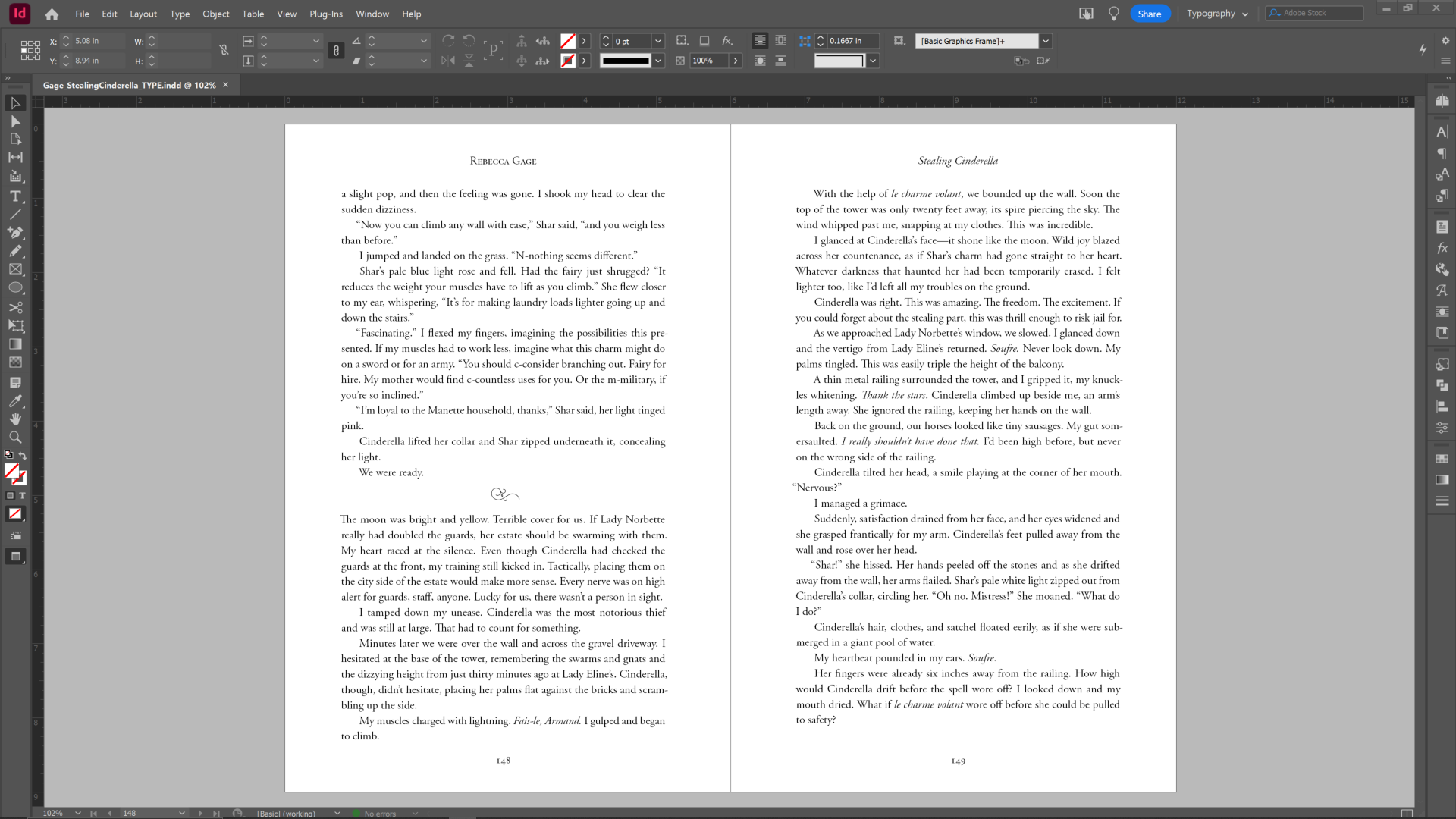
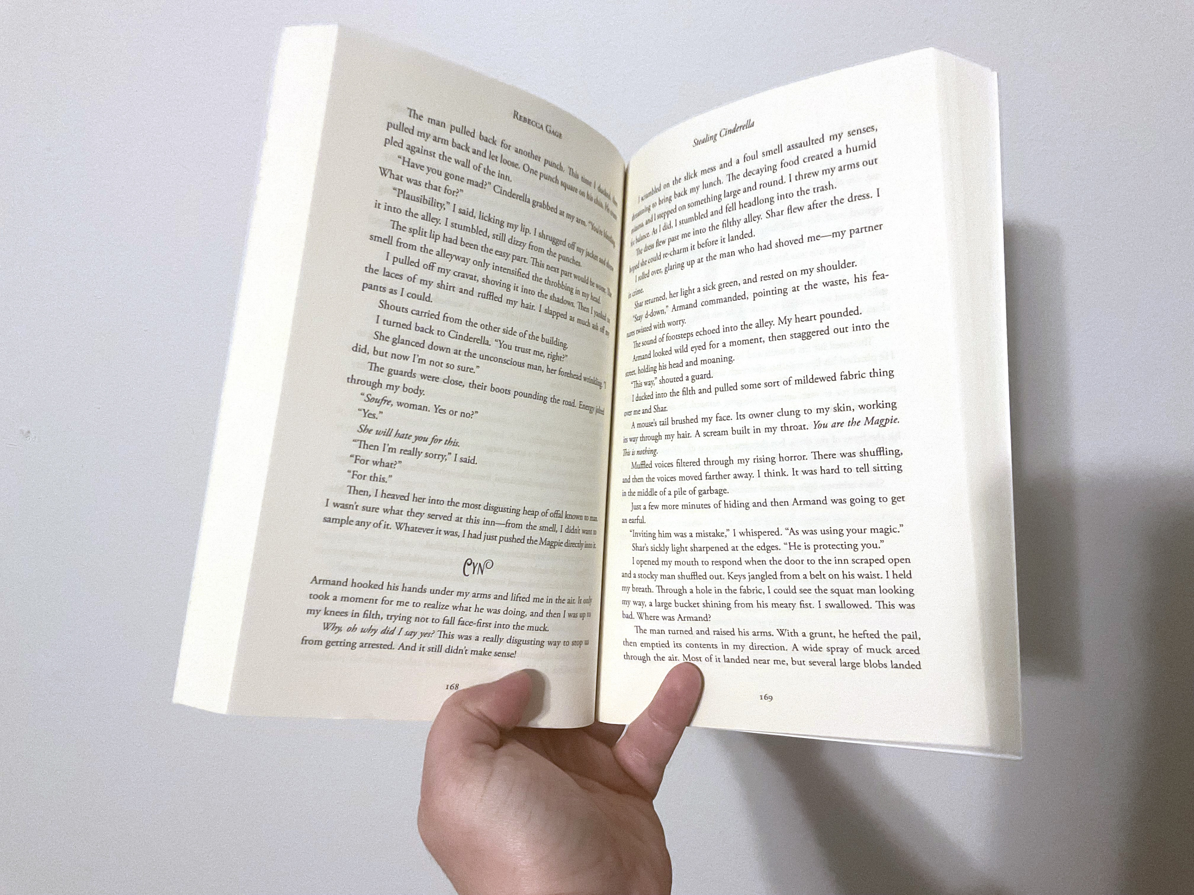
For this project in particular, she wanted a readable and stylish interior that was similar to other YA fantasy novels. She wanted it to be fairly simple, though I had freedom to play around with the typefaces.
Process
• Developmental-edited the manuscript
• Line-edited the manuscript
• Copyedited the manuscript
• Determined the heading typeface based on the cover
• Typeset the text
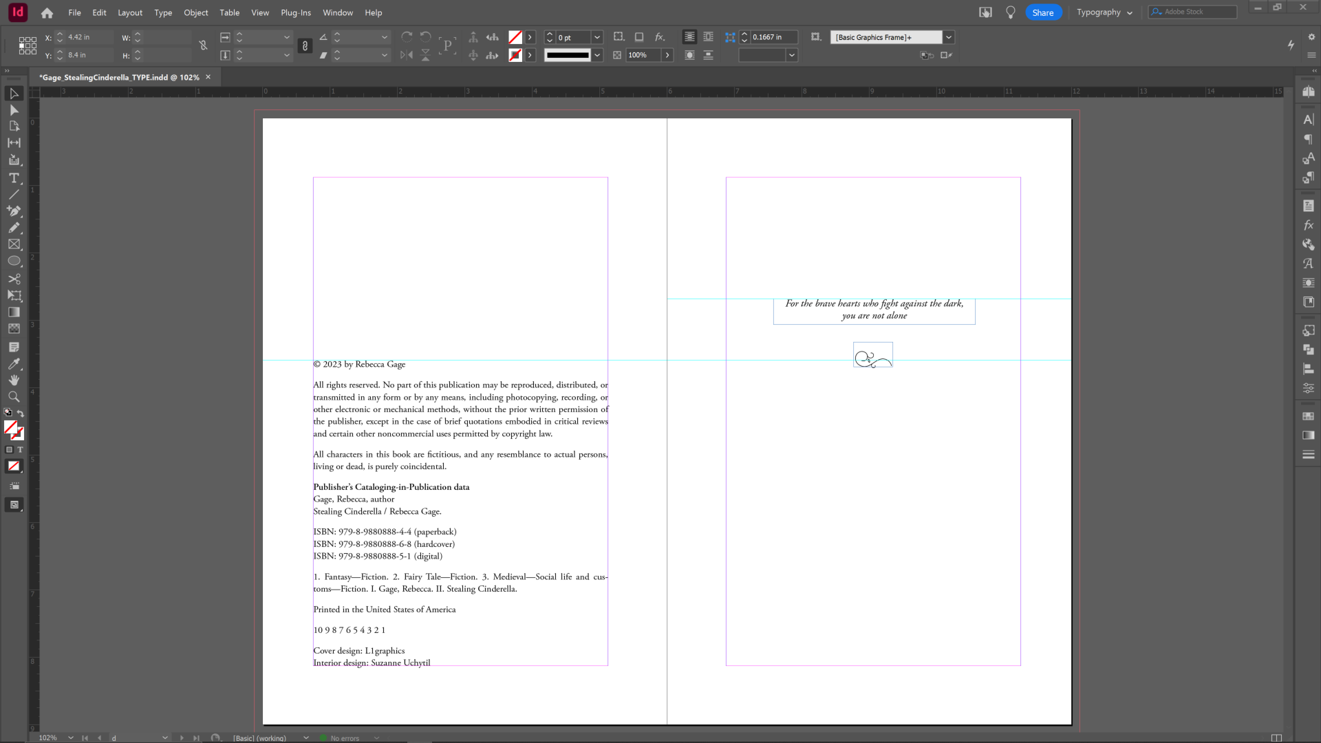
• Formatted the page layouts, including graphics
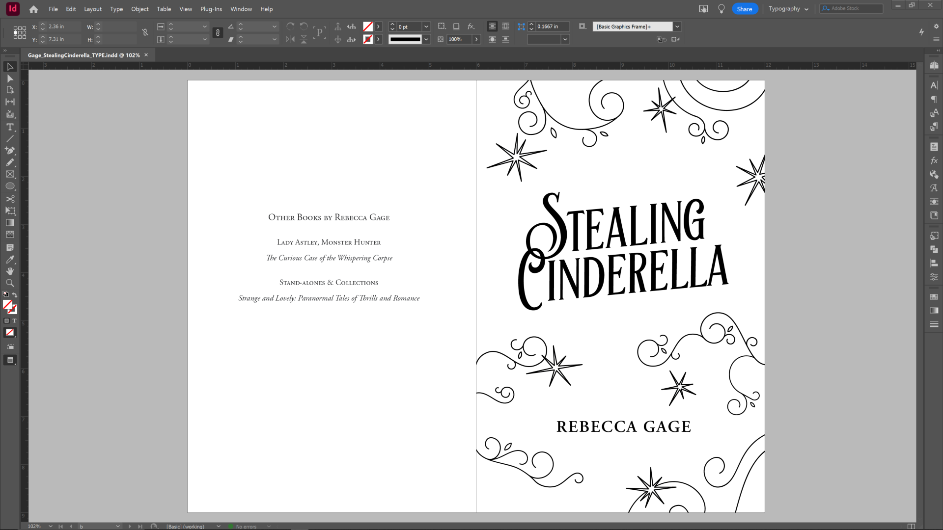
• Added simple, whimsical illustrations to the title page
• Implemented the author’s and publisher’s edits and feedback
• Converted the manuscript to PDF files
• Proofread the manuscript
• Converted the manuscript to EPUB format
• Formatted the EPUB file to prepare it for e-readers
• Uploaded the cover and interior PDFs to IngramSpark and the EPUB to Draft2Digital
Challenges
and Solutions
and Solutions
I wanted to put together a quick but nice illustration for the title page, to make it stand out a bit from the average title page in YA novels. But I wanted to make sure it fit the aesthetic that the author was looking for. Then I remembered that Rebecca had sent me a document with text and ornaments in the typeface she liked for the title (Artisan), and it showed a bunch of ornaments that are included in the typeface. So I took several of those ornaments, turned them into vectors in Illustrator, then copied them over to the title page in InDesign and pieced them together around the title and author name. I also included a few “sparkles” that were my own design. The result was a simple but pretty illustration that perfectly matched the typeface and adhered to the author’s desired aesthetic. Rebecca was delighted.
Tools
• Adobe InDesign
• Adobe Illustrator
• Adobe Acrobat
• Sigil
• Kindle Previewer
Deliverables
• Manuscript evaluation letter (5+ pages)
• Developmental-edited manuscript with Track Changes
• Line-edited manuscript with Track Changes
• Copyedited manuscript with Track Changes
• Guts (interior content) PDF
• Guts PDF in spreads (to portray the layout of the printed book better)
• EPUB
• Packaged and compressed folder with INDD, IDML, link, and font files
Results
and Impact
and Impact
• 67% of the Amazon reviews are 5 stars.
• One reviewer commented, “It was exciting and romantic and the characters were truly enjoyable. It was also a tight story that was well-polished. I loved it!”
• The book was nominated for a Whitney Award and went on to become a Whitney Award Finalist in the Young Adult Speculative Fiction category, going up against giants like Tress of the Emerald Isle by Brandon Sanderson.
Reflection
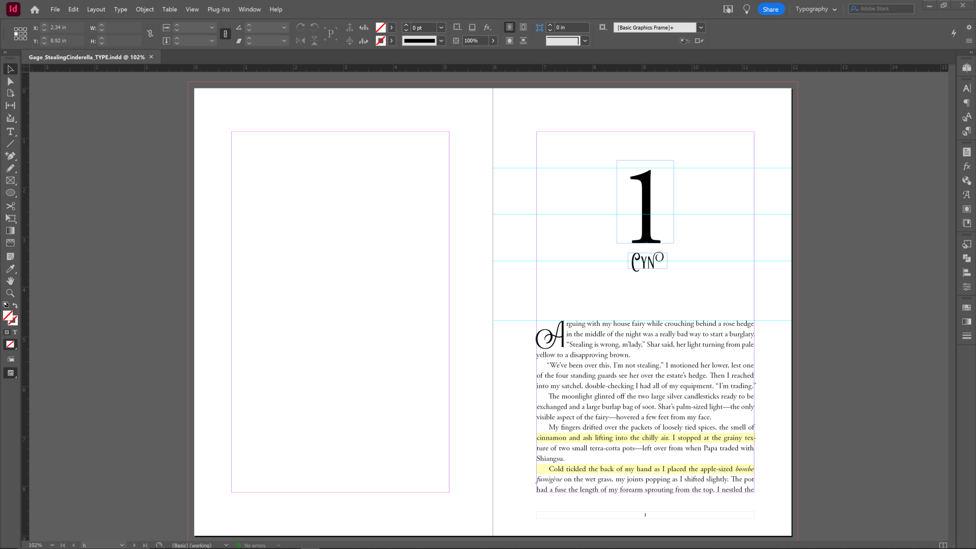
This was a project where I took a little bit of creative freedom with things like the title page, the chapter titles, etc. For instance, at the beginning of every chapter is both the chapter number and the name of the chapter’s viewpoint character. Instead of keeping the name in the same place every time, I decided to move the name around to fit into or beside the oversized number. The result was playful without being too distracting, and the author loved it. This helped me realize that I can trust my imagination more and take more risks to help books stand out.
