Author
Christine Natale
Imprint
Straw Into Gold
Illustrator
Natalya Yeshchenko
Genre
Middle Grade fairy tales
Dimensions
8.5" x 8.5"
Pages
40
Ink and Paper
Standard color on white paper
Overview
Christine Natale found me on Upwork and was impressed that I had connections to Ukraine, since her illustrator, Natalya, was Ukrainian. She had previously published a series of six children’s books (most of the fairy tales were original and written by her), but they weren’t selling well and didn’t look very professional, so she wanted a more stylish, modern, and family-friendly look to them.
Objectives
and Goals
and Goals
Christine wanted me to redesign each book completely—covers and interiors. She had specific ideas for how she wanted her books to look. For instance, the illustrator’s paintings needed to be featured heavily. Also, the series needed to have a consistent style—same typefaces, same style of contents page, same back cover style, etc. Four of the books were season themed, and she wanted the interiors to match the seasons. She also noted that the books weren’t supposed to be for children themselves to read as much as for parents to read to the children, so it was okay to have pages with straight text.
Process
• Designed the full cover
• Typeset the text
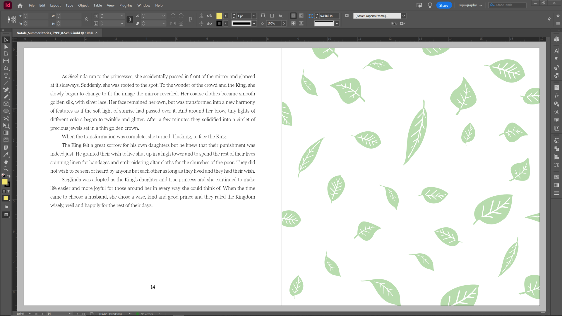
• Formatted the page layouts, including graphics
• Added simple, fairytale-esque illustrations to some of the blank or featured pages
• Implemented the author’s edits and feedback
• Converted the manuscript to PDF files
• Uploaded the cover and interior PDFs to Lulu.com
Challenges
and Solutions
and Solutions
Though Christine was quite easy to work with, the scope and highly visual nature of the project brought out more issues than most of my projects. For instance, at the beginning of every new story, I wanted each drop cap to be a specific color taken from the opposite-page painting. I also wanted to be able to shift the drop caps around as needed so that the text would more easily fit into their gaps and corners. To do this, I removed the in-line drop caps and instead turned them into vector graphics with text wraps. This gave me the freedom to move them around and color them while also providing “drop caps.”
One of the most difficult aspects of designing and typesetting this book was choosing and handling the title typeface, Historia. I suggested the typeface to Christine and she liked it because it was elegant while also being readable and friendly looking. After I began using it, I noticed that it had some typographical errors—in particular, the letters’ baselines didn’t all align. To fix this, in every place where we used Historia, I zoomed in on the text and manually adjusted some of the kerning, baseline shifts, letter height, and so on, making the letters look better aligned and therefore more polished.
Tools
• Adobe InDesign
• Adobe Photoshop
• Adobe Illustrator
• Adobe Acrobat
• Canva
Deliverables
• Full cover PDF
• Cover mockup PNGs and JPGs
• Guts (interior content) PDF
• Guts PDF in spreads (to portray the layout of the printed book better)
• ePUB
• Packaged and compressed folder with INDD, IDML, link, and font files
Results
and Impact
and Impact
One reviewer commented, “[These stories] were a light shining into the darkness that was creeping in around us amidst the wars in Europe and the Middle East and the coinciding eclipse. So when this illustrated edition was published, I immediately wanted to buy it. The illustrations are the quality of the actual imaginations one might create in listening to the stories, colorful and light-filled, dream-like.”
Reflection
The books in Christine’s Fairy Tales series were my first experience in typesetting and designing children’s books. The process was enlightening and taught me a lot. I finished it feeling accomplished and quite satisfied with the work. I had also built a good relationship with the author, who even sent me a thoughtful graduation gift. I would definitely jump on the chance to create a beautiful children’s book again.


